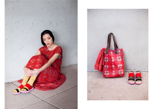
Iconic Diana Vreeland famously once said, “Pink is the navy blue of India!” Her statement rings out like the bell in Korea’s Yongjusa Temple in our time of global economy and world-wide technologies. As the corners of earth are brought together at a rapid clip, Vreeland’s astute observation celebrates the cultural specificity of color, and with this season’s new arrivals we step into colors that complement our personal styles.

In the animal world, color is universally understood. Combinations of yellow and black suggest ‘watch out’. Red and black warns us to ‘stay back!’. In the anthropological realm depending on where we grew up and when, our understanding of color is as specific as our accents and palettes.
Indigo and ultramarine take their names from their geographical origin. Indigo’s etymology comes from the Greek Indikos meaning “Indian dye”, ultra-marine comes from the Latin ultramarinus, literally "beyond the sea”. A romantic nomenclature from the Western explorers who traveled beyond the sea to the mines of Afghanistan to apprehend the vivid blue.
When we study the history of color we find the traits of the pigment are also inextricably tied to the landscape of their origin. Like the arcane recipes invented by monks to make the first bottles of Chartreuse liquor from 130 herbs, plants and flowers specific to their region of France, the harvesting, inventing and manufacturing of pigments has defined empires. Later into the 19th century, contests of chemical prowess were spurred as countries and companies tried fitfully to hold onto proprietary color profiles. France’s Societe d’Encouragement pour L’Industrie Nationale offered a 6,000 francs prize to any chemist who could invent a cheaply reproducible ultramarine— one even the most starving of artists could afford.
Chemically producible pigments were shunned in fine art applications well into the 20th century, but now we rely on them for enhancing the appeal of everyday items like candy and shampoo. As much as marketers would have us believe red means excitement and blue equates strength and stability, we at Baby & Company know that our reaction to color, much like personal style, is individual. What brings us together is our desire to have a natural simplicity to what touches our bodies. We proudly stand by our designers who employ rich, natural and organic vegetable dyes and employ sustainable methods for manufacturing their designs. Come discover the treasures from China, France and beyond the sea this Spring at Baby & Company.
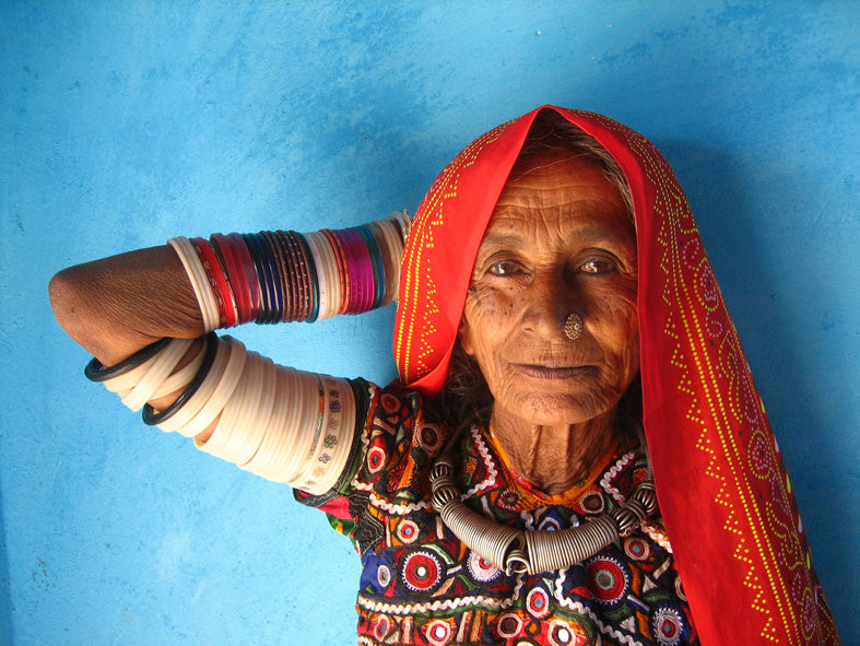
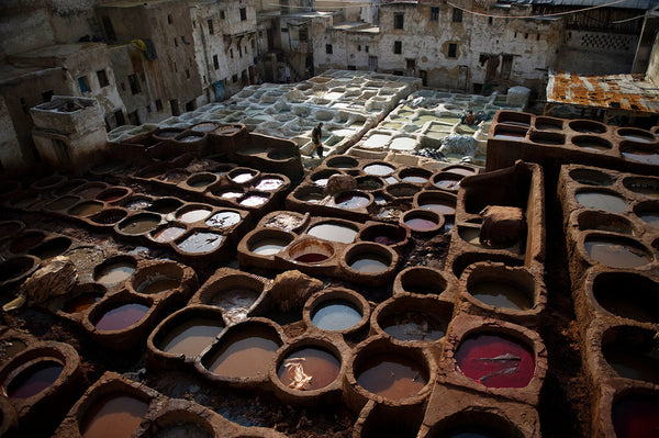
Images: 1- older woman in the Meghwal village of Bhirandiara photographed by Meena Kadri. 2- Songkran festival in Ayutthaya. 3- Leather tannery in Fez.